Assignment 3 – Creating shapes and 3 dimensional forms in fabric
I was looking forward to this chapter. With the painting/dyeing I looked forward to it because it was something I hadn’t done before, but always wanted to try. This chapter I was looking forward to because it’s all about fabric and that’s my “thing”.
So how come ground to a halt on the first exercise?
Glue, it’s the glue….
I hate gluing fabric, I don’t use glue unless I absolutely have to and have explored every possible way of trying to get a stitch in and that includes going down to the tiniest needle, trying bend needles and even flexible beading needles. Ridiculous??? Totally!!!
Why? It changes everything about the fabric, the way it feels, the way it drapes, it just feels wrong.
Now I can see the point in using glue in this exercise, I can see the usefulness of glue in making a quick sample. But still………..
Tutor report form
Overall Comments
You have responded very well to the assignment requirements, Agnes. You have shown a growing ability to select appropriate and suitable starting points from which to develop your ideas and there is evidence of valuable experimentation with a range of techniques and processes. You have a developed good level of technical skills associated with dyeing and printing. The presentation of your work is orderly and progress is well documented in your learning log. It is always a pleasure to look at your work. I look forward to receiving your next assignment.
Feedback on assignment
Project 3: Colour
Your analysis of colour and colour relationships is accurate and perceptive. You are able to recognize subtle tonal differences and you articulate clearly the effects that colours have on one another when they are juxtaposed. I loved the way you tackled the fabric matching exercise. I initially had difficulty recognizing where one ended and the other began. When I looked closely,I could see that there is a slight graying of the paint tone. I’m sure this wasn’t there when the paint was still wet. Some of the difficulty arises because of the pigment in the paint and the fact that fabric printing ink, unlike paint, is absorbed into the fabric fibres and remains locked there.
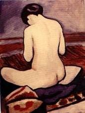
The Kandinsky painting was a good choice. It made you analyse the colours very carefully and demonstrates the point that sometimes, an image can appear deceptively simple. You might like to look at Auguste Macke’s paintings. They have a similar quality in terms of subtle use of colour.
Funny that you should mention Auguste Mack. Although I didn’t really grow up with art, I remember that there was an outlet bookshop that used to sell folders with art prints. I got Auguste Macke’s prints and his paintings of horses were on my wall for a long time.
I do like his work, but there is something that annoys me about it too. He’s painted many ladies and they always feel so demure, maybe even sub servant. Always with the head bowed down, always very modest, never looking at you. Now this may have been a sign of the times he lived in, but makes me feel like I need to get out on the streets and demonstrate for these woman’s rights.
In the colour moods and themes exercise, you made good use of the computer programme to quickly create a range of patterns with which to experiment. You were then able to focus on the colour dimension and allow this to dominate your thinking. It would be interesting to apply what you have learned in terms of colour and mood to commercially produced fabrics. To what extent are they really fit for the suggested use/environment?
That’s a very interesting train of thought, the application of colours and patterns in commercially produced fabrics. Interior design and fashion first spring to mind, but I am also thinking about commercial institutions that try to create an atmosphere with colour and patterns (and even smells), to get their customer in the mood to spend. I will need to dig a bit deeper into this, maybe incorporate in my next “Understanding the textile world”.
The coloured stitch sample was very interesting indeed. The use of complementary red/green maximized the contrast and remarkable differences were apparent in the blocked colour as opposed to line. You commented on the ochre colour which seemed to magically appear. Like you, I tried creeping up on it to catch it unawares, but every time it was there! It is a great example of optical colour mixing. If you mix the three primary colours, you get a brownish shade, not unlike ochre. By mixing primary red and secondary green (primary blue and primary yellow) you optically created ochre. Alchemy!
I never thought of that! You’ve solved the mystery!!!
Now this ofcourse asks for more experimentation yellow/ purple and blue/ orange.
Your pointillist sample was a labour of love and I appreciate how much time this would have taken. Did you subsequently discover who the painter was? The optical colour mixing is most obvious in the harmonious ranges i.e. blue/purple, orange/red. In other areas, the breaking down of colours into contrasting areas reminded me rather of Pop Art painters such as Andy Warhol. A great image with very expressive use of colour.
The ‘accidental shoe raises questions of different people’s perceptions of the same image. I looked at it and thought that it was landscape/rock strata. I never saw the shoe, only the build up of texture through line and shape! The combination of stitch and weave works well with this sample and you controlled the soft colours perfectly.
Understanding the textile world
The textile piece you chose clearly has a very personal meaning for you. It’s interesting to speculate on the associations between textiles and memories. What would people select if they were asked to identify textiles which defined certain events in their lives? Could be a great starting point for a series of related images. It would be good to research your textile a little more in terms of cultural significance. For example, are there certain traditional patterns used for some textiles? Are there common motifs or symbols reflected in other cultures e.g. the paisley or tear drop motif seen so much in Indian textiles and also Scottish textiles? You might try to have a look at the book suggested below.
I did try to find out more about the symbolism in Thai textiles, but didn’t get very far using just the internet. I must admit that although I’ve got a nice collection of textile art books, there are not (m)any about the history of textiles. So I really appreciate the book suggestion. It’s on order right now. And to get a little more “in touch” with the textile world I’ve also signed up for “Fiberarts”, I buy that magazine whenever I am in the US, and only just found out that it’s quite cheap to get a subscription in Europe and for “Textiel plus” a magazine that is published 4 times a year by the Dutch textile foundation. Hopefully that will help me find out about textile exhibitions before they’ve been and gone.
Project 4: Developing design ideas
The first exercise gave you a chance to explore compositional elements and this stood you in good stead when selecting images for pattern manipulation. Your 88 butterfly was a modest image and I’m pleased that you didn’t go down the route of trying to represent it realistically. Your preparation work for this also demonstrated the power of different media to depict very different qualities e.g. the soft oil pastel and the more graphic torn paper collage. You chose well and the latter gave you a good starting point for the kaleidoscope programme. Having looked at the power of colour and mood to stimulate a feeling or connection, you demonstrated this admirably with the reference to your grand mother’s 1970s wall paper! I recognized the association immediately. It’s the brown and orange combination. However, when changed to the bright green it became a different image altogether.
I liked the distorted image very much. It really did appear 3D. It also reminded me of Florentine or bargello canvas work although this is a much more formal and controlled textile technique. It also bore a resemblance to marbled paper. I wonder if you could use a similar technique on fabric? With the net overlay, it had a snakeskin quality. If you have time, I think you should try this on fabric and then work into the surface.
The final pattern moved further away from the original drawing and for me had other, very different associations. It reminded me of Gustav Klimt’s work. You also consider stitching into this piece. I think you should. Whilst you are at it, have a look at the work of Hundertwasser and Nikki de Saint Phalle. You may have to give up the day job!
If only….
I like Klimt’s work, but sometimes I find it a little too sweet.
But I love the naïve edginess of Hundertwasser (I am probably describing this in words that make you cringe, I just never had to describe how I feel about artwork before). As for Nikki de Saint Phalle, her work represents one of live little disappointments. In Rotterdam, years ago, there were plans to build a museum about the workings of the human body. The museum was going to be inside a giant statue of a woman by Niki de Saint Phalle. I was so excited about this, couldn’t wait to see it! Until the people came up in arms, too expensive, ridiculous, horrible looking building, etc., I couldn’t believe it. The plans where trashed and I was highly disappointed.
Project 5: Painting and printing.
The fabric book was an inspired idea for presenting all the work in this section. Your green print demonstrated the power of a single motif used in a simple repeat. Further experimentation would be interesting to see how the feel of the pattern changed with say, a half drop repeat. You could also experiment with overprinting the image in a slightly different shade. However, this worked very well. The gold highlights and red stripes lifted the print further, emphasizing the rounded shapes.
The smaller experimental samples worked less well. The monoprint needed a greater contrast of line and the rice print could perhaps have been extended by the use of a second colour.
I agree with you, I’ve added them to show that I tried a wide variety of techniques and not all of them successfully. I will go back to these and try again. Especially the mono printing, I know there must be a good picture in there somewhere.
By contrast, the shibori was beautifully executed. Although you used black dye, you obtained muted greeny greys. The composition was tight and the dropped motif at the bottom right hand corner created a really exciting dynamic feel. I think this is a technique that you should go further with if you have the time. I kept thinking of rich mosaics, metallic threads. I could go on…
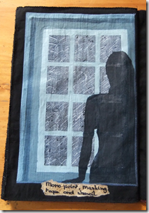
The window is a haunting piece and demonstrates the power of colour to affect the mood of a piece. You effectively combined a number of different techniques in the same sample and there is a strong feeling of directional light coming fro the left hand side. I was reminded of Edward Hopper’s paintings.
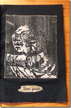
I also liked the lino cut. I wonder what this might look like if it was simplified slightly and then printed in the negative as well as positive?
I’ve been thinking about that too. This was a complicated picture. A negative and positive are very interesting. I was also thinking of maybe echoing two the same prints, slightly off set, almost like a shadow.
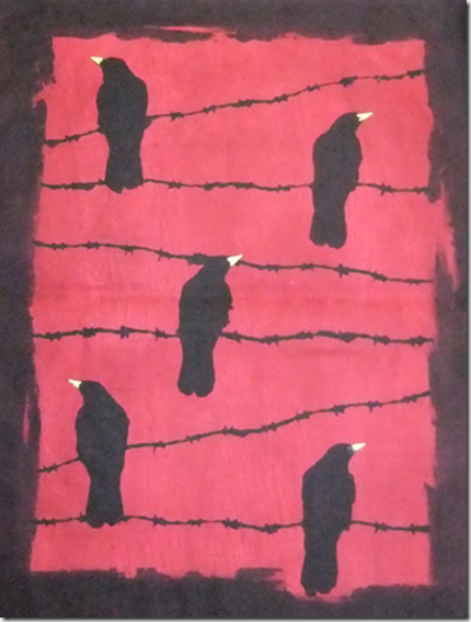
The blood red sky is a scary piece! It is atmospheric and menacing. Did you ever see Hitchcock’s film ‘The Birds’? The use of a touch of yellow was well judged. It provided a focus to the print motif.
I wanted this piece to be haunting, that’s why I found it important to get the right colour red for the sky. And yes I did think of Hitchcock’s birds while I was making this piece. At first I wasn’t sure about adding the beaks, so I cut a few out of paper and laid them down first. Then the decision was easily made.
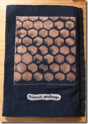
The bleach discharge formed a good end piece to the fabric book. The regular repeat has a pleasing rhythm. You might take this further by offsetting or changing one motif in the same way you did with the shibori. I think it would benefit from a clearer focus in this context.
I would like to experiment further with the bleach, I did find it hard to control.
Even the thick household bleach is quite runny. But I was worried about thickening it, not sure about what chemical reactions this might have caused.
Also the speed of the discharge took me by surprise, I wasn’t finished yet with painting the last shapes or the first ones needed rinsing. With a bit more practice I can see some interesting gradients developing.
Learning logs/critical essays
Your learning log gives a very clear indication of your thinking and choices associated with the development of your work. You express some concern over limited or safe choice of fabrics. You chose appropriately for the particular sample. I would urge you not to throw away samples. They are an important part of your work.
In terms of your doubts and uncertainties, we all have them! You are naturally an instinctive and intuitive worker. What you are gaining from this course is the ability to analyse what you are doing and why. Although you feel your ideas are already formed in your head, the process of working out how you are going to achieve this and the changes you will make along the way inevitably alter the final outcome. A good example of this is the way you tackled the pattern manipulation. I have already seen a change in the way you express your ideas in your log book since the last assignment. Your thinking about your work is beginning to change.
You are very honest about the time issue. It is very real for everyone and is one of the burdens as well as the joy of working with textiles. If you can spare the time and are happy, that’s great. I never have enough time to do everything I want to do.
Sketchbook
Your sketchbook is well integrated within your coursework. If you are intending submitting for assessment, I would try to extend this element if you can, to include additional work not directly associated with project development.
I am still very happy to support the submission of your work for assessment even at this early stage.
Whilst working my way towards the end of this second assignment I started to wonder….
Even though I really enjoyed the drawing and design exercises for this assignment. This really made me focus on one small detail and exploring the design possibilities of it. I found myself back to my old ways when it came to most of the fabric painting exercises.
With my old ways I mean, that the whole picture is already developed in my mind. The design work I then do either on paper or digitally consists mostly of working out measurements and placement (for instance on the Shibori, crows on barbed wire, window and lino print samples). Does this mean I failed the objectives of this assignment? Of course I see the almost endless possibilities in the design techniques demonstrated in the exercises and I will certainly use them, especially when I can’t come up with any spontaneous ideas. But my brain is almost always overflowing with (nearly completed) images of things that need to be created and often creating them is a question of working out how to do this technically.
I also wondered about the amount of work I do. I do have a very hectic day job, so am trying to fit my course work in around it. I do see times that are given as a guideline for each exercise and I find that I spent much more time on most exercises. For instance the final fabric painting exercises calls for ten hours of work, I spent (very happily) at least 40 to 50 hours on the exercise (and I refuse to count the time spent on my little French knot sample). The time spent is not an issue, I love working on my samples. I mostly concentrated on techniques to transfer colour or images to fabric. Yet there is still so much more to explore different textures, patterned fabrics and as I really concentrated on creating finished images I would also like to do more work on creating background or “carrier” fabrics for stitching. Now I can imagine that a lot of these “things” that I still would like to try can be worked into samples for later assignments. But on a whole is the work I am showing for this assignment (varied) enough for assessment?

Do you feel you made a good selection from your drawings to use as source material for your designs ideas? Which interpretations worked best; can you say why?
I think that the drawing of the butterfly wing that I selected as a source for my design ideas was a good one. It had such a strong graphical, almost tribal look with strong colours, that I knew I could have almost endless fun with it. I could focus on the pattern, the colours or both.
Personally I like my third interpretation (the lacy, wavy design), because I can see a textured, maybe even 3 dimensional piece in that design.
Which fabrics did you choose; what particular qualities appealed to you?
For dyeing, painting and printing I haven’t been as adventurous with my fabric choices as I maybe should have. I choose a (sheet-like) white cotton, a white cotton jean type fabric and a black cotton. I mainly choose these, because I thought they would work well with the dyes and paints I used. I still want to do some more experimenting in the future with more textured fabrics and I was thinking about the possibilities of altering patterned fabrics.
Is the scale of marks and shapes on your samples appropriate to the fabric?
Yes, I think they are.
Would any of your ideas work better on a different type of fabric, for example, sheer, textured, heavyweight? Why?
No, I don’t think so. I had some images in mind that worked as pictures, so I don’t think they would come out on textured fabrics, I would have liked to add stitching to some of them, but thought that might distract from the original assignment.
I am very interested in trying some of these pictures on a sheer fabric. And I would love to experiment with textured fabrics, but am thinking more of using these to create a background to a stitch design.
Do the marks and shapes seem well placed, too crowded or too far apart?
The assignment said not to worry about placement, but (at least for me) that is impossible.
So I used guidelines for my stamped and shibori designs. Overall I think it could be neater, but seeing that I have not had any experience to speak of with these techniques, a little more practice should solve this.
Were you aware of negative shapes that where forming between the positive shapes?
This was most apparent in the crows on barbed wire design. I had to reposition the barbed wire a couple of times. This had nothing to do with the barbed wire or the crows itself, but everything with the negative (red) space around them.
What elements are contrasting and what elements are harmonizing in each sample? Is there an interesting tension?
Inkjet print - There is a lot of contrast in this piece, the colours are in strong contrast to each other, but also the pattern, sharp corners vs. rounded lines. To me it still is a harmonious piece though, partly because of the repetition in the pattern, but also because of the colours that although very contrasting appear to have the same dusky value to them.
The tension in this piece comes for me from the pattern the gentle rounded lines vs. the sharp corners.
Green stamped sample – the harmony here is the combination of the stamp and the background.
The stamp is kind of diffused, which for me matches the dusky green. The contrast comes from the painted and foiled wonder under. The tension comes from the cross hatched lines.
Reclining nude – this sample is all about contrast and the tension that causes.
Shibori – The shibori technique is about the contrast between the dyed and undyed areas of the fabric. Although I think there is a harmony in the monochrome colour pallet. For me the tension comes from the “dropped “ little square in the bottom corner.
The window – Although this whole picture is done in blues, there is quite a strong colour contrast. At the same time the blue pallet pulls the picture together. The tension is caused by the addition of the silhouette of a lady.
Lino print – This was meant to have a very strong contrast, so not much harmony here.
The tension for me is caused by the rather haunting picture.
Crows on barbed wire – This is (again) a sample that is very strong in contrast. The harmonizing comes from the little yellow beaks. It made such a difference when I added them, like the whole picture came alive. The tension comes for me from the positioning of the crows and wire against the background.
Bleach discharge – Bleach and black fabric will always cause a strong contrast in colour. The harmony here comes from the repetitive pattern. The tension from the different shades of discharged colour.
How successful do you think your larger sample is? Do you like the design? Have you recreated or extended your ideas from smaller samples so that there is a visual development between the two?
All of the larger samples in my “book” started out very differently.
The green stamped sample was just a quick freehand trial in lino cutting. I tried the stamp on paper first and then stamped the fabric, then I figured it needed something “more” and added the cross hatching. So this was very much a “make-it-up-as-you-go-along” sample.
The shibori sample was much more of a mathematical exercise. I knew what kind of design I wanted, then it was a question of working out the measurements which I did on the computer.
The window was also a “picture in my head” for which I did a sketch. This was not a design sketch, but more so I would not forget about the idea. Working out the actual design was also more about measurement and proportions, which I did on the computer.
The design for “crows on barbed wire” was a rough sketch at first I worked out the final placement digitally as well.
Of course all of my samples started out with little trials, experiments with masking tape, a wax resist and stencils for instance. I just need to learn to keep these for reference.
I’ve got an annoying habit of being very stingy with my materials. So I cut up some small pieces of fabric and try a stamp, a colour or anything else until there is no space to try anything anymore. Then they will turn into a rag to wipe my brushes.
Does your repeating design flow across the surface, without obvious internal edges or do the shapes and marks in your single unit sample relate well to the size and shape to the fabric?
Do they make an interesting composition on this large scale?
I am not sure how to answer this, my only truly repetitive design is the crows and I think that absolutely requires the larger scale. Any smaller and it simply wouldn’t have the same impact.
Within the design there are no obvious edges, except that I bordered the design for display purposes. But my daughter loved it so much that she could see a jacket made in that pattern, so I guess that means it would work as a fabric.
The shibori and green stamped samples are of course repetitive accept for the dropped block and turned stamp, but thinking about it I would still do that even if I would create yardage using these designs. And I don’t think there is anything within these two designs that would stop the flow if yardage with these patterns was required.
For my single unit samples I think “the window” would work on almost any scale. And I would love to make a larger (A3- size) lino print, but didn’t have the tools to pull this off. I do think most of my samples will work on most scales.
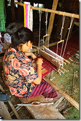
About ten years ago we went on a holiday to Thailand. We travelled around the country for about four weeks, with our backpacks. We went somewhat “off the beaten track” and met some wonderful people. Midway through the holiday we stayed for a few nights with a lovely Thai family in Sukothai.
 Our host was very kind and took us to see some wonderful sights and places. On one of these trips we came across a very poor area of Sukothai. A village of wooden houses on stilts, underneath the houses the women of the village were weaving cloth in traditional designs. They were working on very simple looms and I was amazed how fine the fabric was they created. It looked like the cotton they used was dyed in the village as well, long lengths of it where hanging everywhere. However the language barrier stopped me from finding that out.
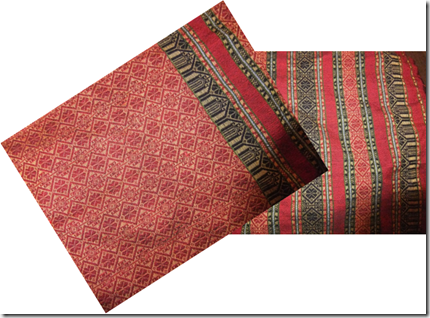
We choose two pieces of fabric which traditionally would be used as scarves and our host started haggling for us. We felt a little embarrassed. Of course you are supposed to haggle in Thailand, but things were already cheap in our (spoiled western) eyes and it was clear how much work went into creating these scarves. So we left a good tip (to the dismay of our host, who thought we were to soft).
At the time the idea was that I could use the fabric for one of my projects, but I’ve never had the guts to cut into them. So for the past ten years they’ve been used as table runners.

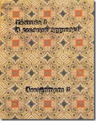
 For this I wanted to use one of the designs that I had made earlier with the butterfly wings. And seeing as I wanted to add the “title” I figured printing might be a good idea.
So time to play a little more with Golden’s digital ground and the inkjet printer.
I must say I am very impressed with this stuff. I painted on two thin layers and despite adding this ground, after printing the hand of the fabric returned almost back to it’s original state. This was a firm jean type fabric to start with so I will have to experiment some more with lighter weight fabrics.
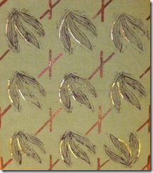
 For this sample I dyed my fabric a pale green. Then I cut a stamp out of lino freehand and painted one side of some thin strips of wonder under. First I stamped the fabric with an (almost) repetitive pattern. Then I placed the painted wonder under strips onto the fabric and ironed them in place. Finally I added some wonder under covered with foil.
This piece was very much “make-it up-as-you-go-a-long”, but initially I thought about adding the strips in a plaid type pattern. After laying them out that way they felt so stark and formal, not in tune with the stamped pattern at all. So a change of plan was needed.
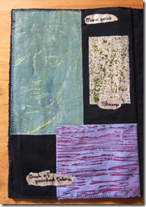
 On this page you can see various small samples.
The pale blue one is a mono print. I rolled some paint onto a sheet of plastic and scratched the face into the paint with a skewer.
The little beige and green sample is a stamp made from rice grains. For this I took a piece of cardboard that I covered with double sided tape and dipped into some rice. I can see possibilities in this for as a background.
The bottom sample is the backside of a piece of painted fabric. The paint seeped through and formed an interesting pattern.
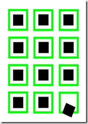
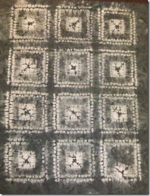
My first trial with shibori. Actually a combination of 2 shibori techniques, maki-age en ori-nui. Now this all sounds very professional, but was my first ever attempt at this. On paper my design looked like this:
 The inner squares are 4x4 cm, then there is 2 cm space and then a 1 cm wide border. In between the borders there is also 2 cm space.
And simply because I find neat and tidy rather boring…the last square fell out of place.
The inner squares where done with maki-age shibori and the outer squares with ori-nui shibori.
After sowing all the lines and pulling everything tight, I dyed the fabric with black Dylon.

For my first attempt I am reasonably pleased with the result.
One border (bottom left) hasn’t come out as well as the rest. But overall not too bad, I think.
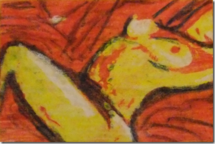
 In my cellar I found a box of Pentax crayons, these where once bought for my daughter to decorate t-shirts when she was much younger. These crayons are used directly onto the fabric.
My inspiration for this piece was my French knot sample. I made a stencil and used a water-soluble wax resist. First I “waxed “ the areas that were supposed to stay white then went over the whole picture with yellow. Then I “waxed” through my stencil the areas that were to remain yellow, etc. After the red layer I decided to add the blue freehand.
The crayons are made permanent by heat setting with an iron.
Ever since seeing Patrick Caulfield’s painting of a window and visiting an  Edvard Munch exhibition the next day I’ve had this picture in my head. I just needed to work out how to execute it. I started by mono printing the dark sky and rain in the same way as I mono printed the small sample of the face. Next I used masking tape to create the window and finally I stenciled the lady looking out of the window. There is a problem with the window showing through the lady’s figure.
With the masking tape the paint was layered a bit thicker then I normally would. This worked well for the window, but means it does show through. This gives it an almost ghost like feeling. Something to watch out for next time!
 The last time I worked with lino was probably when I was 8 years old.
But after making the stamp for my green fabric I wanted to try something a little more intricate. I found a fabulous photo on the internet, that I kept as an inspiration for a doll. I decided to turn the picture into a sketch (digitally). I transferred this sketch onto the lino with carbon paper and cut the design. I ended up with this print, which although not perfect pleases me a lot. I can really see me doing more of these in the future. Especially if I can get my hands on some finer cutting tools.
For my crows on barbed wire I wanted a blood red sky. A colour that wasn’t that easy to create. Every time I thought I had the right shade it dried to light. Until I worked out that I needed to layer the red to create a blood red sky.
I cut some stencils from printer paper that were kept in place with the help of a temporary glue spray. A touch of yellow for the beaks made the whole picture come to live.

 The final sample in my book is a honey comb stencil on a black fabric. Instead of paint I used household bleach to create the picture.


![clip_image004[1] clip_image004[1]](http://lh5.ggpht.com/_JSCL9R77DvQ/TT0dkRwqBSI/AAAAAAAAA3w/pjUoSqh6q5g/clip_image004%5B1%5D_thumb.jpg?imgmax=800)
![clip_image006[1] clip_image006[1]](http://lh6.ggpht.com/_JSCL9R77DvQ/TT0dlNyMLRI/AAAAAAAAA34/cQs8ua7OBzM/clip_image006%5B1%5D_thumb.jpg?imgmax=800)
![clip_image008[1] clip_image008[1]](http://lh4.ggpht.com/_JSCL9R77DvQ/TT0dmaTd8XI/AAAAAAAAA4A/rL-oFK2oz4k/clip_image008%5B1%5D_thumb.jpg?imgmax=800)
![clip_image010[1] clip_image010[1]](http://lh6.ggpht.com/_JSCL9R77DvQ/TT0dnHhE_9I/AAAAAAAAA4I/EIuPtC7AIyw/clip_image010%5B1%5D_thumb.jpg?imgmax=800)
![clip_image012[1] clip_image012[1]](http://lh4.ggpht.com/_JSCL9R77DvQ/TT0dpIY2JcI/AAAAAAAAA4Q/VHyea4Fm2bc/clip_image012%5B1%5D_thumb.jpg?imgmax=800)
