I’ve got a few days off work between Christmas and the New Year, so time to dye, paint and stamp fabrics. And although I still can’t draw or paint to save my life, I’ve been really looking forward to this. I always wanted to experiment more with dyeing and painting, the main drawback has always been that I need to use my kitchen for this. So it’s near impossible to get anything started after a day at work.
Ah well, better make the most of my holiday!
How many ways to draw a neglected 88?
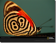
 For the next exercise I choose this picture of a neglected 88 butterfly.
I never heard of it before but I was struck by the tribal look of this little creature.
For exercises 1 to 3 I drew it in pencil, oil pastels, soft pastels, watercolour pencils and torn paper collage.
Then the real fun started the exercise told us to develop design ideas from the drawings.

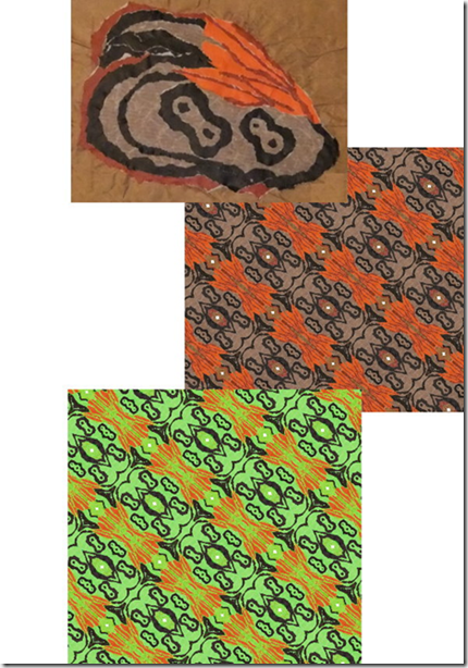
I started with the collaged wing. I photographed it. And used the kaleidoscope function on my graphics software until I created a nice design.
I liked the design, but it did feel like the curtains that my grandma had in the seventies.
So I decided to make some changes to the colour. I upped the yellow and green hues and ended up with a very light and bright picture.
But more definition was needed, so I copied everything with the colour black from the second picture and pasted it on my lime green background.
Now this was much better, but one more detail was needed.
Next I copied everything with the colour orange and pasted that on my lime and black design.
From boring and quite dull, I feel I have gone to a vibrant and exciting design.

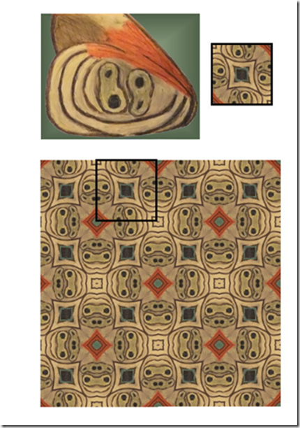
Next up was the oil pastel wing.
I also used the kaleidoscope function on this. But this time I cut a little square out of the pattern that emerged and pasted a lot of these squares together.
This resulted in this design (the marked out square shows the size and pattern that I started out with).
I really like this design, I can see this in a combination of patchwork, embroidery and raised couched threads.

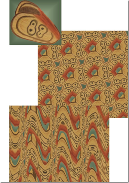
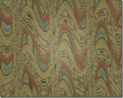
For the final design I used the soft pastel wing.
I started out again with the kaleidoscope function, which gave the picture a feel of chunky woodblocks.
I wanted something a little more delicate so I decided to add some waves.
This gave me the idea of 3 dimensional or raised work.
I pictured a green (gradient) background with an overlay of rows of waves.
The longer I looked at this the more I thought about the waves being layers of needle lace.
I wondered if I could make this visual in a picture?
I can see this either as a wall-hanging with a raised surface or maybe even a green tubular vase with an overlay of lacy waves.

I found it pretty amazing how different all these designs turned out, after all the all they all came from the same picture!

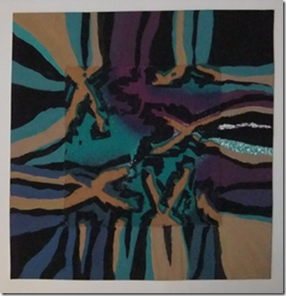
First I did the exercise with the blocks, lines and moving space.
Then I had some digital fun with shapes.
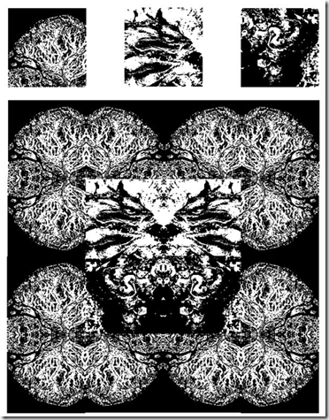
I “cut” some shapes out of 3 digital pictures and started playing with them.
Pasting, rotating, adjusting colour and turning them into black and white pictures.
Here is one example.
Above the three picture cut outs I used. The original pictures where satellite pictures of the earth from the National Geographic site.
Did you enjoy working with colour and were you able to mix and match colours accurately?
I did enjoy working with colours and I think I came close to matching the colours.
I achieved an almost perfect match while the paints were still wet, but of course they dry a little duller.
Were you able to use colour expressively?
I had to give this some thought. Seeing as a lot of my work is done from reality (pictures).
I never had to give colour as a separate component that much thought. I found it really interesting to use colour as a starting point instead of an afterthought.
In the end I think I succeeded in what I set out to do in the French knot picture and was able to use colour expressively there.
Did the exercises help you to really see colour instead of accepting what you thought you saw?
Yes, the exercises definitely helped me to see the real colours, instead of what my brain assumes is the colour.
Did you prefer working with watercolours or gouache paints? What was the difference?
For the exercises where I needed to match colours I preferred the gouaches. It gave me much more control over the end result. I found it easier to mix matching colours with the gouaches and because the colours are opaque I didn’t have to worry about the influence of the background on the final colour.
How successful were the colour exercises in stage 5? Where they more or less interesting than the painting exercises?
Hmmm…to be totally honest…I still feel much more comfortable with a needle, thread and fabric. So I really enjoyed the stitching exercises in stage 5 and 6. But the question is more or less interesting and then I do have to say that I’ve learned the most and discovered some things I really didn’t know whilst doing the painting exercises.
If you enjoyed them more, were there any factors that made them more exciting?
I think for me the excitement came from working with a limited, predetermined colour range.
That was a design challenge!
Posted by
Agnes Iley
9:26 AM
For this exercise I needed to work in pastels. Hmmm….don’t have many of those either, after some digging I found some “powdery” colours of thread. And seeing as we are hit by heavy snow and the roads are like sheets of ice, they simply have to do.
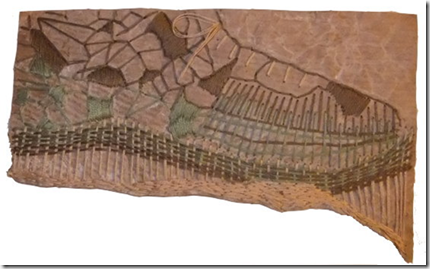
So I thought I would make the background a little more interesting. For some strange reason I love brown wrapping paper and paper bags. So I got a piece out crumpled and torn it and fused it to a piece of felt. I thought the colour might be a bit too strong so I gave the paper a little white wash.
Then I started stitching, I followed the lines of the torn paper and some of the crumpled lines. While I was working that little voice at the back of my head kept trying to tell me something, but I didn’t want to listen. Until my husband walked by and said “nice shoe”.
Sigh…..my total random stitching had produced a shoe, it couldn’t be more of a shoe if I planned it to be a shoe. So what could I do but add laces and give in?

When I thought about pointillism I always thought of paintings that looked like blown up giant newspaper photo’s. A bit like Marcus Harvey’s controversial portrait of Myra Hindley. Although this was not build up with dots, but a small child’s handprint, the concept is more or less the same. So I was surprised when I looked up Seurat’s work and saw the subtlety in his work. I expected strong graphics.
For this exercise I was inspired by the many pictures I’ve seen over the last couple of days.
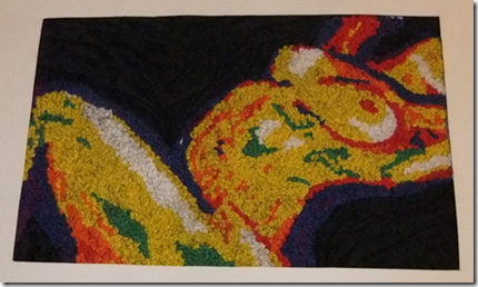
I was looking at paintings done mostly in primary colours and wondered if it was possible to recreate this in French knots.
 I found this picture on the internet. And immediately made a mistake, I didn’t write down the artists’ name. Since then the website has been down and I can’t go back to find out.
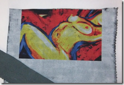
So I had some digital fun with this picture…..I posterized, lowered the number of colours and then replaced the colours with primary colours.
Then it was time to experiment with a new product, Golden’s digital ground. And although I’ve experimented with printing textiles before, this one was new to me. At first I was a bit disappointed, you paint it on like a gesso.
Hmmm….this would change the hand and texture of the fabric tremendously….or not?
After applying two thin layers, I put the fabric through the printer. Now I must tell you this was a proper embroiderer’s linen so very coarse and totally unsuitable for this sort of thing.
And what a surprise! Without changing the printer settings I ended up with the most vivid picture I ever printed on fabric! Very crisp and the fabric’s textures still showed!
I know I am going to have a lot more fun with this product….

Anyway this is what I ended up with.
The strip in the corner shows what the fabric was like before using the digital ground.
Pretty amazing I think.
This picture immediately caused me some trouble, of course there was not one red, one yellow or one blue. Instead of blending the colours I decided I wanted strong colour blocks, so I used white, blue, purple, red, orange, yellow and green to fill in the picture with French knots.
After filling the picture in with French knots I added black silk to the background that I stitched down so it looked like a crumpled sheet.

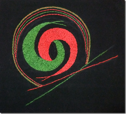
This exercise called for a black background and 2 primary colours….
The black background was no problem. But after searching high and low I only managed to find one primary colour in my small stash of embroidery threads.
And there was no way I would make it before closing time to the nearest craft shop anytime soon…..hmmm. I decided to work with what I had and use red and green.

There are subtle changes in tone and brightness depending if the stitched areas are nearer each other or further apart. The most interesting effect however is in the other ring, where a line of red stitches is sandwiched in between two lines of green stitches. Every time I glance at it sideways it appears as if there is an ochre colour there. Now of all the colours I expected ochre was not one of them!
I think I already wrote about my uncertainty to split hairs between what creates a mood.
Is it the colour, the mark or both?
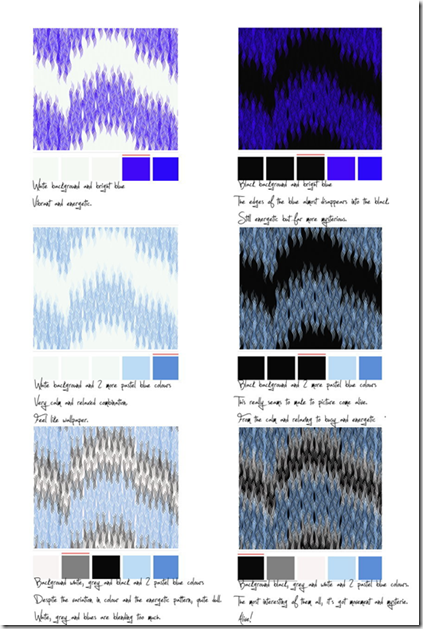
I decided to try a little experiment. On the website www.colourlovers.com you can pick a pattern from their library and play with the colours in that pattern.

What a difference a colour makes……
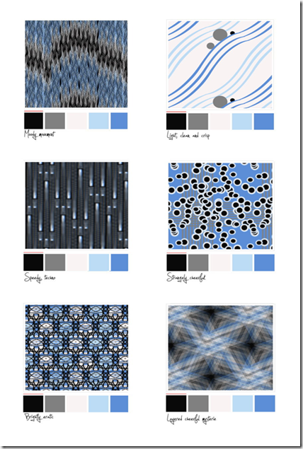
However did this answer my initial question? Well no… I needed to repeat my little experiment by keeping the same colours but this time changing the pattern. Now I ended up with this.

Based on this little experiment I dare to say that the colour influences the mood more than the marks. Every time the blue shines through the strongest I can’t seem to call it anything but “bright” and “cheerful”. Even in a potentially very moody pattern like the last “woven style one”.
No pictures for this exercise….the camera had run out of batteries and the still life got eaten before the batteries where charged…..Unbelievable, that no one in my house recognizes a tangerine and a lemon on a piece of blue paper as a work of art! That and I needed the lemon to cook dinner.
But I did observe some interesting effects, where the lemon and tangerine touched there was a distinct change in colour. The colour change was strongest where the lemon and blue background met….. a distinct green hue appeared in the colour of the lemon.
I am always drawn to artists who can tell a whole story in a few simple lines or a few “blobs” of colour. To be able to simplify and still have such an impact is something I greatly admire. So for this exercise I decided to use “Improvisation 6 (African)” by Wassily Kadinski.
I framed a small portion of the painting and tried to match the colours within the frame.
 On first sight only a few colours where used to create this painting:
Black
White
Red
Yellow
Blue
Green
However on close inspection I saw so many different colour tones and areas where the colours are mixed with each other on the canvas that I ended up with quite a few more colour swatches. And every time I look at this picture I think there are more colours to be found.
Posted by
Agnes Iley
9:17 AM
Now this was fun!

Take a colourful piece of fabric and mix and match paints to match the colours.
I started with a piece of cotton and instead of just painting little marks of colour next to the fabric, I decided that it would be much more fun if I tried to make the fabric “disappear” in my paintwork. So with a pencil I extended the fabric pattern and started to fill this in with the paint I mixed. I really enjoyed doing this exercise, although I am a little disappointed. While the paint was still wet the colours matched perfectly, however when dry they dulled down a little. Not sure how to avoid this….maybe mix a little varnish into the paint, to give it a “wet-look”? Hmm…..
 For this exercise I started with the three primary colours.
First I painted little blobs of pure colour, and then I mixed them with white, grey, black and their complementary colour.
I found this a very interesting exercise. Although the blue and red stayed throughout the exercise in close range to the original colour the tonal differences are distinct and something I had never thought of. My idea was to add black to make a colour darker and white to make it lighter. It never occurred to me what this would mean for the tone and vibrancy. Also mixing it with it’s complementary colour would have never entered my mind.
Food for though and experimentation!
Next up are the same colour blocks, but this time with a small grey square in the middle.
Interestingly the grey square seems to take on a bit of it’s surrounding colour.
On black the grey square appears to be a deeper more beautiful grey tone, on green the little grey square appears to take on a greenish hue, on blue a blue hue, etc.
I guess this would mean that in a very vibrant piece of work a little touch of grey can be used as a blender or a “resting point” for the eye.
Posted by
Agnes Iley
9:13 AM
Of course my coloured papers, that I know I have somewhere were nowhere to be found.
So while I was at the art shop I got some coloured sheets of paper too.
I made my coloured squares and will try to write down my observations here.
 Black/blue – The blue square looks definitely much brighter than in any of the other combinations. It also gave me the feeling of looking down a tunnel, where the blue appears to be the light at the end.
Green/Blue – This is to me the most harmonious combination. The blue appears a little darker but the presence of the blue square seems to mellow the very vibrant green a little.
Light blue/Blue – Both are blues, but probably as far apart as you can get within one colours range. The icy and very cold light blue against possibly the warmest blue possible. This makes the smaller blue square very dominant. The small blue square looks darker and not as vibrant, while the icy blue looks even paler and seems pushed further and further away in the background.
Yellow/Blue – The warmth and vibrancy of the yellow has a positive effect on the little blue square, for me the blue square is here at it’s best. Warm, vibrant and with a beautiful tone.
Red/Blue – Forceful red and vibrant blue are fighting here all the way. This combination immediately draws the attention, but has got a very restless and uneasy feel about it.
In this tone and vibrancy a combination that is small doses could definitely liven things up.
Pink/Blue – The blue makes the pink appear to be a warmer colour then it actually is. The blue looks to have lost a little vibrancy here.
Stage 1 Introduction and preparation
This second assignment has got me quite excited.
Very strange….I don’t draw or paint, but still…..can’t wait till I reach the chapters where I can get the fabrics out and start dying and painting them. But as always I am trying to run before I can walk. There is a colour wheel to be made!
 So of I went, upstairs to get my big tubes of paints out. I mixed up the right colours and the wheel was made in a jiffy. The next morning I saw the results of my paintwork, it looked like the colours had split whilst drying. Hmmm, maybe I needed better quality paints?
So of to the art shop, ouch those gouaches are expensive! Luckily Winsor & Newton have got a boxed set of CMYK mixing colours, that was just what I needed and far more reasonably priced.

| Student name: | Agnes Iley |
| Student number: | 506379 |
| Course/Module title: | Textiles 1 |
| Assignment number: | 1 |
Overall Comments
A great start to the course, Agnes. You first assignment shows a clear understanding of the connections between mark making, drawing and textile based work. All your work is beautifully presented and very well executed. Well done.
Feedback on assignment
Project 1: Making Marks
Your reservations regarding your drawing abilities are actually working in your favour by making you seek unusual and creative solutions to the course requirements. You have indeed shown that the term, drawing can be interpreted in a much broader way and less conventional way than you have maybe previously thought. I thought that the use of the Picasso painting was an excellent way of really focusing and making you look very hard at the different qualities of line in the portrait. You analysed these very well indeed and this is something you could maybe return to in order to strengthen this skill.
I also liked the way you used and manipulated digital imagery to experiment with different linear qualities. There are close links here between the ways in which you approach hand and machine stitching. Could you take this further by using these computer generated images to inform textile samples?
My usual way of working is with digital imaging and creating my textile samples from there. On the one hand I was unsure if this was allowed for the assignments of the course and on the other, I really want to learn new techniques and taking the digital route feels a little like taking the easy way out.
I will try to find a balance between the two.
A useful point of reference here might be Op Art painters such as Bridget Riley and Victor Vaserely. The preciseness in their work has similarities with your own approaches.
The names Bridget Riley and Victor Vaserely didn’t ring a bell with me until I googled them and saw their work. It brought a smile of recognition, I am sure that as a teenager my schoolbooks had book covers made from Bridget Riley printed paper. And of course I have seen Victor Vaserely’s work as well.
I’ve always been interested in the “optical illusion” in art, especially when it comes to creating movement.
The collaged tissues piece is lovely. I like the way you have combined the papers in an informal and free way. Again, further exploration through scanning and digital manipulation would yield rich results for future textile work. If you can get hold of a copy of Surfaces for Stitch by Gwen Hadley, I think this may inspire you to take this approach further. Similarly, the bleached papers had a strong ethnic pattern feel to them. They made me think of Javanese batiks.
Unfortunately Surfaces for Stitch appears to be out of print. But I did get Gwen Hadley’s latest book, Drawn to Stitch. This book could have been written for this OCA course, it is almost scary how the book follows the course assignments.
And backgrounds (although probably not as in depth as in her previous book) are part of the material as well.
Project 2: Developing marks into stitch/making textures
A great deal of experimentation going on here! I’m glad you have discovered oil pastels. These again will help you to free up your work a little. You could try using it more thickly on the paper and then scratching into the surface. I will send you a scan of a sketchbook page to look at and you will see what I mean.
 I love the examples of your sketchbook pages you sent me.
And it shows me that I still got steps to make when it comes to “moving freely” when it comes to drawing. The scratching in crayon is a great suggestion.
I visited an exhibition by Edvard Munch this week and although I primarily know him from his paintings and of course one in particular. I was in total awe by his drawings, litho’s and his dry needle work. Where he scratched the scene with a needle in a layer of paint.
With very simple lines he managed to create very moving pictures.
I immediately had to think about your recommendation of scratching into the wax.
Something I will definitely try.
I was interested to read your comments about re discovering the joys of hand stitching. I too had a similar moment a while ago and found that the slower pace had a good rhythm to it which was quite refreshing after years of machine embroidery. I think it sometimes allows you time to reflect more deeply on what you are hoping to achieve.
By contrast, your bobbin sample was highly controlled and very textural. A brave choice to work a circle. I liked the finished piece for its control but I wonder what might happen if you took a slightly freer, more random approach? How about using your tissue collage as a starting point for bobbin work?
I can see so many possibilities as well, finding time is the main issue at the moment. But you are absolutely hit the nail on the head here……I am a control freak when it comes to my work. And one of the reasons for taking this course is that I would like to work in a freer more spontaneous way.
Your black fabric samples were a joy to look at. They were all very well executed and the restriction of your colour palette to black, white and silver allowed the focus to remain very much on the surface quality. I loved the whip stitch squares. Changing the direction really emphasized the surface you created.
The faceless crowd.
Please don’t tell me again that you can’t draw! The starting point is a wonderful example of drawing from imagination. Ok, so you call it doodling but you captured the spirit of what you were trying to express perfectly. Think of drawing as being for different needs and purposes, drawing from observation, imagination, memory, to record ideas etc. Here, you have used it very effectively to inform the development of yours ideas further into a very competent and original sample. Subsequent experimentation with a range of fabrics, stitch, colours etc enabled you to successfully achieve what you set out to do. The preparatory work shows a considerable ability to select and then refine your choices coupled with a high degree of technical skills in the final execution. Do you know the work of Patrick Caulfield? The outlining of shapes and the blocking of flat colour in your work reminded me of his paintings.
I wasn’t familiar with the work with Patrick Caulfield, but just spent some time looking at his website. And I do like the colour blocks and outlining he does.
My favorites are “N Along a twilighted sky” and “Pot plant”.
The batik sample was equally successful but in a very different way. You again made excellent use of colour analysis though observation to inform your choice of thread. The selection and combination of stitches was effective in suggesting the bark texture. Two days was a labour of love but well worth it in my opinion. I would like you to put examples of your work onto the OCA website so that other students can look at them. Can you digitally enlarge the bark sample so that you can see the quality of stitch close up?
All the work I’ve done for this assignment, I’ve uploaded to my folder on the OCA website. The pictures will enlarge when you click on them and show the stitch in more detail.
Sketchbook
Your project work was very well documented and you were selective in terms of your response to the requirements. This is a skill which usually takes new students a while to achieve. Your presentation is first rate and lent a very coherent feel to the assignment. For your next assignment, I would like you to think about extending your sketchbook to include work outside the project requirements. Have a look at the OCA’s guidelines on keeping a sketchbook. You can use it to record observations, annotate your drawings to suggest how you might use them in the future to inform the development of your work, refer to the work of other artists etc. I suspect that you are a very meticulous worker but it’s OK to experiment in your sketchbook.
If you saw me work you would never guess I am a meticulous worker, but yes I am. I work in complete chaos, doesn’t matter if it’s artwork or office work. But still…the end result has to be meticulous.
I will try to refer more to artists that inspire me, or don’t (sometimes I think it’s just as important to discover what you don’t like) and will include some more of the work I’ve done outside the assignments to my sketchbook.
Learning logs/critical essays
I really liked the way you tackled this and I felt that you gave me good insider knowledge in terms of the way your ideas progressed and developed. You made excellent use of self evaluation in order to identify aspects of your personal development with a good deal of constructive and positive criticism. Again, where possible, try to make links between your own work and that of other artists, designers and craftspeople. How have they influenced your work? What do you like/dislike and why?
Suggested reading/viewing
See above and also, Alice Kettle, textile artist, particularly in relation to the dense machine stitching.
On a recent trip to England to visit relatives we took a trip to “The needle mill museum” in Redditch. They had an exhibition by Alice Kettle and friends.
I absolutely loved her work and her 2 books ranked high on my birthday list.
“Machine stitch perspectives” arrived yesterday and “The eye of the needle” I’ve ordered directly from her website and will hopefully arrive sometime next week.
Other
You mentioned having a mount cut for your work. Have you thought of buying a mount cutter? I have one which is very easy to use and will cut an angled edge like the one on your mount. It is called Logan Team System and consists of a steel rule and an angled replaceable blade in a holder. If you are intending to do a lot of window mounting, it will save you a lot of money. I think mine was about £35.
I looked at cutting systems in my local art shop and they were very expensive and seeing as this was my first ever framed work I didn’t mind buying it.
But it is definitely something to look into for the future!
Although this first assignment is diagnostic, you may like to think about whether you would like to submit your work for formal assessment at the end of the module. Even at this early stage, I would be very happy to support you.
Is the next assignment date realistic? We can negotiate if necessary.
When I was looking for courses my only objective was to find a course that would help me develop my creative skills. When I realized that a degree was actually an option, I started feeling ambitious. But I’ve made myself a promise, I will keep doing courses as long as I feel it’s fun. I’ve got a very hectic and busy fulltime day job and when it starts to feel like work then I know it’s time to stop. But until then I’ve decided I would like to keep my options open and to go for formal assessment.
I am delighted that you are willing to support me in this and will be very grateful for any help you can offer me!
I shouldn’t have any problems making the next date. I am looking forward to a 2 week holiday around Christmas and some undisturbed playtime!
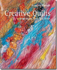
Inspiration, Texture & Stitch
Sandra Meech
 The question about logs, blogs and sketchbooks kept lingering on my mind. So I decided to “Google” the subject and this book was frequently mentioned.
This book is all about how to develop your creative ideas.
It starts by looking at how to develop an idea you might have. Expand on your idea, by looking at it from different angles, which could give more depth and interest to your final design. One of the techniques used for this is mind mapping.
A technique I find one of the most annoying hypes of recent years in my workplace. But I could see how it could be useful in developing a design idea. Other techniques are geared to get the creative juices flowing when you haven’t decided on a subject matter yet. Amongst other things collage, painting papers, tearing and weaving are used for this.
Throughout the whole book the importance of sketch- and logbooks is emphasized. And helpful hints are given on how to work with them.
The book ends with chapters on how to create volume and relief (texture) and comes up with some interesting techniques on how to achieve this.
Examples are the use of wireform, hobby glue, folding, relief paste and stitching.
There are no projects in this book, instead it’s filled to the brim with ideas and techniques. Perfect for me, I buy books for the techniques and then hope to go my own way with the things I’ve learned.
On a personal note
The writing in this book in combination with the pictures, gave me a much clearer idea about how to use my log- and sketchbooks. I need to look at it differently. I am not jotting down my homework and I am not writing essays for my exams. These books are just there to help me in the design process, they are there to develop the ideas I have. It doesn’t matter if they are going to materialize into anything.
Do you feel happy with the work?
Hmmm…..overall I do feel happy with the work. The drawing and working with sketchbooks is so far out of my comfort zone. At the same time the whole design element was my main reason to sign up for this course. So after a few anxious days I decided to jump in head first.
Still wondering if I interpreted the assignments right and simply if my work is good enough to make the grade though.
Do you prefer working with stitch to drawing? Can you begin to see the relationship between the two?
I definitely prefer to work in stitch. A lot of this has to do with my lack of drawing skills. But fabrics have always been my “thing”. I can look at interesting objects or people and will start to think about constructing them in textiles.
I can definitely see the relationship between stitch and drawing. I always have.
I compensated for my lack of drawing skills by using digital techniques.
I added some small samples of this to my sketchbook, but am not sure if working with digital techniques is permitted for assessment.
Having worked through stage 2, were you able to choose stitches which expressed the marks and lines of your drawings?
Now that was the fun part! Feeling so much more comfortable with stitch I really enjoyed the “translation”. For some odd reason I feel so much less restricted when stitching!
Do you feel you had the right source material to work from?
This comes back to me wondering if I interpreted everything right.
I made a lot of scribbles and sketches, but got a bit stuck when I had to make a sample from a drawing “with strong lines or linear qualities”. So I scribbled and scribbled and wasn’t happy with anything. Until I threw the assignment aside for a day and just started “playing”.
Still wondering if this sketch qualifies as having strong lines and linear qualities. But I was actually quite happy and surprised with myself after drawing the “faceless crowd”.
Do you think your samples work well irrespective of the drawing? Or do you think your sample is just a good interpretation of your drawing and nothing more?
The first sample stands by itself, I think. But this also caused by the fact that it isn’t a sample as such, more like a complete work.
The second sample is more like a real sample and yes I do think it works irrespective of the drawing, partially because I changed my goals a little. I didn’t so much went for recreating the drawing, but concentrated much more on how to create the textures.
Which of the activities did you prefer – working with stitch to create textures or working with yarns to make textures? Which worked best for you and why?
I like both techniques and I don’t have a strong preference either way. I choose a technique based on the effect I like to achieve and both techniques can create a textural effect in a very different way. What excited me most was the textural stitch, simply because I hadn’t done this before and I can see many possibilities for future use.
Make some comments on individual techniques and sample pieces. Did you experiment enough? Did you feel inhibited in any way?
- Oil pastels, maybe the most surprising discovery for me. I loved working with them. They force me to leave any of my perfectionist ideas behind and just work in broad strokes. This really helped me to loosen up a bit with the drawing.
- Hand embroidery, is not something I do a lot and I really enjoyed it! I can see many possibilities for this in the future. I particularly enjoyed the textural effect of the tree sample, but also liked the scattered French knot sample.
- Abstract thinking, my work tends to be very realistic. This sometimes surprises me, because personally I do really enjoy abstract art. So what pleased me most about the way the “faceless crowd” turned out was that it has a strong realistic reference, but also an abstract quality. For the same reason I like the little hand embroidered sample with just straight and bend lines (bottom picture on page 11 of my log).
- Free motion machining; definitely a challenge, but a technique that I would love to perfect. I love the possibilities and the fact that there are no restrictions.
- Drawing, this definitely tends to bring out the worst in me. I can actually totally freeze, when faced with a sheet of paper and a pencil. Reading Sandra Meech’s book (see book reviews) definitely helped me. The realization that I didn’t need to create a masterwork, drawing is just a means to an end and that sketchbooks are not for anyone’s eyes, but yours (this course being the exception there) helped me a lot.
I don’t think I will ever be finished experimenting. I’ve got very lively imagination and an active mind. So one thing will always lead to another and another and….
I am fully aware that I create my own inhibitions. In my day job I am a confident person who will defend her opinions to everyone. When it comes to my “artwork”, I doubt everything.
I am also a horrible perfectionist, so things can always be better.
However I have learned not to let that stop me anymore. The success my dolls had in various exhibitions helped a great deal. And a good telling off by one the judges (now a great friend) helped me no end. When I started pointing out the mistakes in my doll she missed, she told me in no uncertain terms, that not a single person there had seen these or recognized them as mistakes and that I needed to get over myself! So I am a lot better, but I don’t think I’ll ever stop questioning what I do, but I guess that will also make me better in the end.
How do you prefer to work? From a drawing or by playing with yarns and materials to create effects? Which method produced the most interesting work?
Seeing my earlier answers I definitely find it easier to play with materials. However I would prefer to have some drawings to back my designs up. I’ve often have more ideas then my little brain can hold and to be able to put my ideas on paper would help me a lot.
Also I really enjoyed the process of the first sample where I worked from a drawing and made 2 little samples, scribbling down notes on how to improve the samples really focused my mind. The most interesting work for me was definitely produced by working with sketches.
This was not necessarily the easiest or best work, but it’s the technique I want to develop further.
Are there any other techniques you would like to try? Are there any samples you would like to do in a different way?
My hands are itching to start combining some of the techniques that I learned with some of my 3 dimensional work. I have got a challenge coming up next year with the theme “Enchanted forest” and I was thinking weeping willow. A willow merged with a person. Some of the textural techniques will definitely find their way into that one!.
I would like to make another version of my “faceless crowd” sample. This time with the appliquéd fabric, I really liked the “painterly” feel of that little sample.
Is there anything you would like to change in your work?
For the moment I really would like to get a critique from my tutor.
To give me an idea if I am on the right track. There are so many components to the course work and at some point I have doubted them all. Is my logbook what it should be? Or am I writing a drama in six parts? Have I put enough work in my sketchbook? Have I done enough work overall? Is my stitch work up to scratch? I had to make a conscious decision to leave these doubts behind me and wait for the feedback on my first assignment. I am hoping that this will point out any mistakes I have made and will make me feel more confident about how to go about the next assignment.


