I’ve got a few days off work between Christmas and the New Year, so time to dye, paint and stamp fabrics. And although I still can’t draw or paint to save my life, I’ve been really looking forward to this. I always wanted to experiment more with dyeing and painting, the main drawback has always been that I need to use my kitchen for this. So it’s near impossible to get anything started after a day at work.
Ah well, better make the most of my holiday!
How many ways to draw a neglected 88?
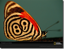
 For the next exercise I choose this picture of a neglected 88 butterfly.
I never heard of it before but I was struck by the tribal look of this little creature.
For exercises 1 to 3 I drew it in pencil, oil pastels, soft pastels, watercolour pencils and torn paper collage.
Then the real fun started the exercise told us to develop design ideas from the drawings.

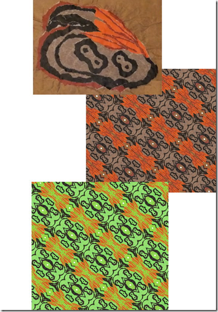
I started with the collaged wing. I photographed it. And used the kaleidoscope function on my graphics software until I created a nice design.
I liked the design, but it did feel like the curtains that my grandma had in the seventies.
So I decided to make some changes to the colour. I upped the yellow and green hues and ended up with a very light and bright picture.
But more definition was needed, so I copied everything with the colour black from the second picture and pasted it on my lime green background.
Now this was much better, but one more detail was needed.
Next I copied everything with the colour orange and pasted that on my lime and black design.
From boring and quite dull, I feel I have gone to a vibrant and exciting design.

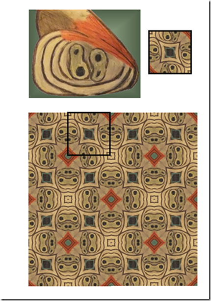
Next up was the oil pastel wing.
I also used the kaleidoscope function on this. But this time I cut a little square out of the pattern that emerged and pasted a lot of these squares together.
This resulted in this design (the marked out square shows the size and pattern that I started out with).
I really like this design, I can see this in a combination of patchwork, embroidery and raised couched threads.

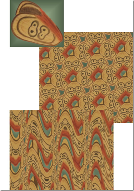
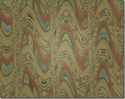
For the final design I used the soft pastel wing.
I started out again with the kaleidoscope function, which gave the picture a feel of chunky woodblocks.
I wanted something a little more delicate so I decided to add some waves.
This gave me the idea of 3 dimensional or raised work.
I pictured a green (gradient) background with an overlay of rows of waves.
The longer I looked at this the more I thought about the waves being layers of needle lace.
I wondered if I could make this visual in a picture?
I can see this either as a wall-hanging with a raised surface or maybe even a green tubular vase with an overlay of lacy waves.

I found it pretty amazing how different all these designs turned out, after all the all they all came from the same picture!

First I did the exercise with the blocks, lines and moving space.
Then I had some digital fun with shapes.
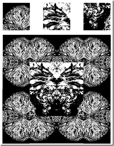
I “cut” some shapes out of 3 digital pictures and started playing with them.
Pasting, rotating, adjusting colour and turning them into black and white pictures.
Here is one example.
Above the three picture cut outs I used. The original pictures where satellite pictures of the earth from the National Geographic site.
Did you enjoy working with colour and were you able to mix and match colours accurately?
I did enjoy working with colours and I think I came close to matching the colours.
I achieved an almost perfect match while the paints were still wet, but of course they dry a little duller.
Were you able to use colour expressively?
I had to give this some thought. Seeing as a lot of my work is done from reality (pictures).
I never had to give colour as a separate component that much thought. I found it really interesting to use colour as a starting point instead of an afterthought.
In the end I think I succeeded in what I set out to do in the French knot picture and was able to use colour expressively there.
Did the exercises help you to really see colour instead of accepting what you thought you saw?
Yes, the exercises definitely helped me to see the real colours, instead of what my brain assumes is the colour.
Did you prefer working with watercolours or gouache paints? What was the difference?
For the exercises where I needed to match colours I preferred the gouaches. It gave me much more control over the end result. I found it easier to mix matching colours with the gouaches and because the colours are opaque I didn’t have to worry about the influence of the background on the final colour.
How successful were the colour exercises in stage 5? Where they more or less interesting than the painting exercises?
Hmmm…to be totally honest…I still feel much more comfortable with a needle, thread and fabric. So I really enjoyed the stitching exercises in stage 5 and 6. But the question is more or less interesting and then I do have to say that I’ve learned the most and discovered some things I really didn’t know whilst doing the painting exercises.
If you enjoyed them more, were there any factors that made them more exciting?
I think for me the excitement came from working with a limited, predetermined colour range.
That was a design challenge!
Posted by
Agnes Iley
9:26 AM
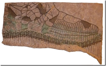
For this exercise I needed to work in pastels. Hmmm….don’t have many of those either, after some digging I found some “powdery” colours of thread. And seeing as we are hit by heavy snow and the roads are like sheets of ice, they simply have to do.
So I thought I would make the background a little more interesting. For some strange reason I love brown wrapping paper and paper bags. So I got a piece out crumpled and torn it and fused it to a piece of felt. I thought the colour might be a bit too strong so I gave the paper a little white wash.
Then I started stitching, I followed the lines of the torn paper and some of the crumpled lines. While I was working that little voice at the back of my head kept trying to tell me something, but I didn’t want to listen. Until my husband walked by and said “nice shoe”.
Sigh…..my total random stitching had produced a shoe, it couldn’t be more of a shoe if I planned it to be a shoe. So what could I do but add laces and give in?

When I thought about pointillism I always thought of paintings that looked like blown up giant newspaper photo’s. A bit like Marcus Harvey’s controversial portrait of Myra Hindley. Although this was not build up with dots, but a small child’s handprint, the concept is more or less the same. So I was surprised when I looked up Seurat’s work and saw the subtlety in his work. I expected strong graphics.
For this exercise I was inspired by the many pictures I’ve seen over the last couple of days.
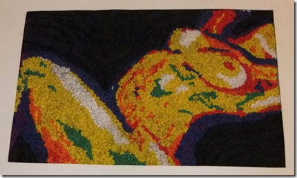
I was looking at paintings done mostly in primary colours and wondered if it was possible to recreate this in French knots.
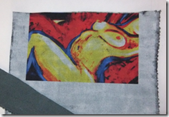
 I found this picture on the internet. And immediately made a mistake, I didn’t write down the artists’ name. Since then the website has been down and I can’t go back to find out.
So I had some digital fun with this picture…..I posterized, lowered the number of colours and then replaced the colours with primary colours.
Then it was time to experiment with a new product, Golden’s digital ground. And although I’ve experimented with printing textiles before, this one was new to me. At first I was a bit disappointed, you paint it on like a gesso.
Hmmm….this would change the hand and texture of the fabric tremendously….or not?
After applying two thin layers, I put the fabric through the printer. Now I must tell you this was a proper embroiderer’s linen so very coarse and totally unsuitable for this sort of thing.
And what a surprise! Without changing the printer settings I ended up with the most vivid picture I ever printed on fabric! Very crisp and the fabric’s textures still showed!
I know I am going to have a lot more fun with this product….

Anyway this is what I ended up with.
The strip in the corner shows what the fabric was like before using the digital ground.
Pretty amazing I think.
This picture immediately caused me some trouble, of course there was not one red, one yellow or one blue. Instead of blending the colours I decided I wanted strong colour blocks, so I used white, blue, purple, red, orange, yellow and green to fill in the picture with French knots.
After filling the picture in with French knots I added black silk to the background that I stitched down so it looked like a crumpled sheet.

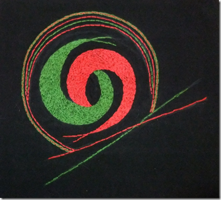
This exercise called for a black background and 2 primary colours….
The black background was no problem. But after searching high and low I only managed to find one primary colour in my small stash of embroidery threads.
And there was no way I would make it before closing time to the nearest craft shop anytime soon…..hmmm. I decided to work with what I had and use red and green.

There are subtle changes in tone and brightness depending if the stitched areas are nearer each other or further apart. The most interesting effect however is in the other ring, where a line of red stitches is sandwiched in between two lines of green stitches. Every time I glance at it sideways it appears as if there is an ochre colour there. Now of all the colours I expected ochre was not one of them!


