I think I already wrote about my uncertainty to split hairs between what creates a mood.
Is it the colour, the mark or both?
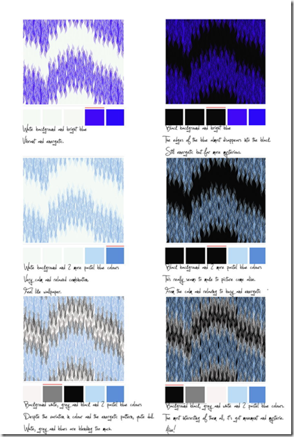
I decided to try a little experiment. On the website www.colourlovers.com you can pick a pattern from their library and play with the colours in that pattern.

What a difference a colour makes……
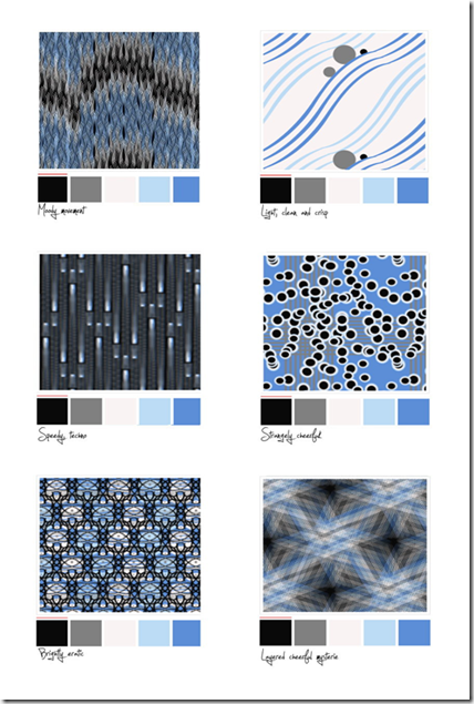
However did this answer my initial question? Well no… I needed to repeat my little experiment by keeping the same colours but this time changing the pattern. Now I ended up with this.

Based on this little experiment I dare to say that the colour influences the mood more than the marks. Every time the blue shines through the strongest I can’t seem to call it anything but “bright” and “cheerful”. Even in a potentially very moody pattern like the last “woven style one”.
No pictures for this exercise….the camera had run out of batteries and the still life got eaten before the batteries where charged…..Unbelievable, that no one in my house recognizes a tangerine and a lemon on a piece of blue paper as a work of art! That and I needed the lemon to cook dinner.
But I did observe some interesting effects, where the lemon and tangerine touched there was a distinct change in colour. The colour change was strongest where the lemon and blue background met….. a distinct green hue appeared in the colour of the lemon.
I am always drawn to artists who can tell a whole story in a few simple lines or a few “blobs” of colour. To be able to simplify and still have such an impact is something I greatly admire. So for this exercise I decided to use “Improvisation 6 (African)” by Wassily Kadinski.
I framed a small portion of the painting and tried to match the colours within the frame.
 On first sight only a few colours where used to create this painting:
Black
White
Red
Yellow
Blue
Green
However on close inspection I saw so many different colour tones and areas where the colours are mixed with each other on the canvas that I ended up with quite a few more colour swatches. And every time I look at this picture I think there are more colours to be found.
Posted by
Agnes Iley
9:17 AM
Now this was fun!

Take a colourful piece of fabric and mix and match paints to match the colours.
I started with a piece of cotton and instead of just painting little marks of colour next to the fabric, I decided that it would be much more fun if I tried to make the fabric “disappear” in my paintwork. So with a pencil I extended the fabric pattern and started to fill this in with the paint I mixed. I really enjoyed doing this exercise, although I am a little disappointed. While the paint was still wet the colours matched perfectly, however when dry they dulled down a little. Not sure how to avoid this….maybe mix a little varnish into the paint, to give it a “wet-look”? Hmm…..
 For this exercise I started with the three primary colours.
First I painted little blobs of pure colour, and then I mixed them with white, grey, black and their complementary colour.
I found this a very interesting exercise. Although the blue and red stayed throughout the exercise in close range to the original colour the tonal differences are distinct and something I had never thought of. My idea was to add black to make a colour darker and white to make it lighter. It never occurred to me what this would mean for the tone and vibrancy. Also mixing it with it’s complementary colour would have never entered my mind.
Food for though and experimentation!
Next up are the same colour blocks, but this time with a small grey square in the middle.
Interestingly the grey square seems to take on a bit of it’s surrounding colour.
On black the grey square appears to be a deeper more beautiful grey tone, on green the little grey square appears to take on a greenish hue, on blue a blue hue, etc.
I guess this would mean that in a very vibrant piece of work a little touch of grey can be used as a blender or a “resting point” for the eye.
Posted by
Agnes Iley
9:13 AM
Of course my coloured papers, that I know I have somewhere were nowhere to be found.
So while I was at the art shop I got some coloured sheets of paper too.
I made my coloured squares and will try to write down my observations here.
 Black/blue – The blue square looks definitely much brighter than in any of the other combinations. It also gave me the feeling of looking down a tunnel, where the blue appears to be the light at the end.
Green/Blue – This is to me the most harmonious combination. The blue appears a little darker but the presence of the blue square seems to mellow the very vibrant green a little.
Light blue/Blue – Both are blues, but probably as far apart as you can get within one colours range. The icy and very cold light blue against possibly the warmest blue possible. This makes the smaller blue square very dominant. The small blue square looks darker and not as vibrant, while the icy blue looks even paler and seems pushed further and further away in the background.
Yellow/Blue – The warmth and vibrancy of the yellow has a positive effect on the little blue square, for me the blue square is here at it’s best. Warm, vibrant and with a beautiful tone.
Red/Blue – Forceful red and vibrant blue are fighting here all the way. This combination immediately draws the attention, but has got a very restless and uneasy feel about it.
In this tone and vibrancy a combination that is small doses could definitely liven things up.
Pink/Blue – The blue makes the pink appear to be a warmer colour then it actually is. The blue looks to have lost a little vibrancy here.


