About ten years ago we went on a holiday to Thailand. We travelled around the country for about four weeks, with our backpacks. We went somewhat “off the beaten track” and met some wonderful people. Midway through the holiday we stayed for a few nights with a lovely Thai family in Sukothai.
 Our host was very kind and took us to see some wonderful sights and places. On one of these trips we came across a very poor area of Sukothai. A village of wooden houses on stilts, underneath the houses the women of the village were weaving cloth in traditional designs. They were working on very simple looms and I was amazed how fine the fabric was they created. It looked like the cotton they used was dyed in the village as well, long lengths of it where hanging everywhere. However the language barrier stopped me from finding that out.
We choose two pieces of fabric which traditionally would be used as scarves and our host started haggling for us. We felt a little embarrassed. Of course you are supposed to haggle in Thailand, but things were already cheap in our (spoiled western) eyes and it was clear how much work went into creating these scarves. So we left a good tip (to the dismay of our host, who thought we were to soft).
At the time the idea was that I could use the fabric for one of my projects, but I’ve never had the guts to cut into them. So for the past ten years they’ve been used as table runners.

 For this I wanted to use one of the designs that I had made earlier with the butterfly wings. And seeing as I wanted to add the “title” I figured printing might be a good idea.
So time to play a little more with Golden’s digital ground and the inkjet printer.
I must say I am very impressed with this stuff. I painted on two thin layers and despite adding this ground, after printing the hand of the fabric returned almost back to it’s original state. This was a firm jean type fabric to start with so I will have to experiment some more with lighter weight fabrics.
 For this sample I dyed my fabric a pale green. Then I cut a stamp out of lino freehand and painted one side of some thin strips of wonder under. First I stamped the fabric with an (almost) repetitive pattern. Then I placed the painted wonder under strips onto the fabric and ironed them in place. Finally I added some wonder under covered with foil.
This piece was very much “make-it up-as-you-go-a-long”, but initially I thought about adding the strips in a plaid type pattern. After laying them out that way they felt so stark and formal, not in tune with the stamped pattern at all. So a change of plan was needed.
 On this page you can see various small samples.
The pale blue one is a mono print. I rolled some paint onto a sheet of plastic and scratched the face into the paint with a skewer.
The little beige and green sample is a stamp made from rice grains. For this I took a piece of cardboard that I covered with double sided tape and dipped into some rice. I can see possibilities in this for as a background.
The bottom sample is the backside of a piece of painted fabric. The paint seeped through and formed an interesting pattern.
My first trial with shibori. Actually a combination of 2 shibori techniques, maki-age en ori-nui. Now this all sounds very professional, but was my first ever attempt at this. On paper my design looked like this:
 The inner squares are 4x4 cm, then there is 2 cm space and then a 1 cm wide border. In between the borders there is also 2 cm space.
And simply because I find neat and tidy rather boring…the last square fell out of place.
The inner squares where done with maki-age shibori and the outer squares with ori-nui shibori.
After sowing all the lines and pulling everything tight, I dyed the fabric with black Dylon.

For my first attempt I am reasonably pleased with the result.
One border (bottom left) hasn’t come out as well as the rest. But overall not too bad, I think.
 In my cellar I found a box of Pentax crayons, these where once bought for my daughter to decorate t-shirts when she was much younger. These crayons are used directly onto the fabric.
My inspiration for this piece was my French knot sample. I made a stencil and used a water-soluble wax resist. First I “waxed “ the areas that were supposed to stay white then went over the whole picture with yellow. Then I “waxed” through my stencil the areas that were to remain yellow, etc. After the red layer I decided to add the blue freehand.
The crayons are made permanent by heat setting with an iron.
Ever since seeing Patrick Caulfield’s painting of a window and visiting an 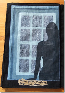 Edvard Munch exhibition the next day I’ve had this picture in my head. I just needed to work out how to execute it. I started by mono printing the dark sky and rain in the same way as I mono printed the small sample of the face. Next I used masking tape to create the window and finally I stenciled the lady looking out of the window. There is a problem with the window showing through the lady’s figure.
With the masking tape the paint was layered a bit thicker then I normally would. This worked well for the window, but means it does show through. This gives it an almost ghost like feeling. Something to watch out for next time!
 The last time I worked with lino was probably when I was 8 years old.
But after making the stamp for my green fabric I wanted to try something a little more intricate. I found a fabulous photo on the internet, that I kept as an inspiration for a doll. I decided to turn the picture into a sketch (digitally). I transferred this sketch onto the lino with carbon paper and cut the design. I ended up with this print, which although not perfect pleases me a lot. I can really see me doing more of these in the future. Especially if I can get my hands on some finer cutting tools.
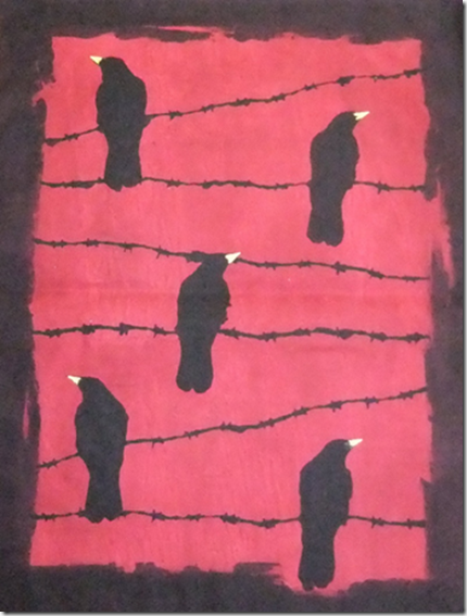
For my crows on barbed wire I wanted a blood red sky. A colour that wasn’t that easy to create. Every time I thought I had the right shade it dried to light. Until I worked out that I needed to layer the red to create a blood red sky.
I cut some stencils from printer paper that were kept in place with the help of a temporary glue spray. A touch of yellow for the beaks made the whole picture come to live.
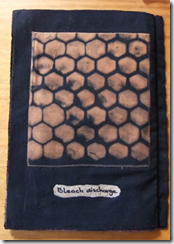 The final sample in my book is a honey comb stencil on a black fabric. Instead of paint I used household bleach to create the picture.
I’ve got a few days off work between Christmas and the New Year, so time to dye, paint and stamp fabrics. And although I still can’t draw or paint to save my life, I’ve been really looking forward to this. I always wanted to experiment more with dyeing and painting, the main drawback has always been that I need to use my kitchen for this. So it’s near impossible to get anything started after a day at work.
Ah well, better make the most of my holiday!
How many ways to draw a neglected 88?
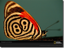 For the next exercise I choose this picture of a neglected 88 butterfly.
I never heard of it before but I was struck by the tribal look of this little creature.
For exercises 1 to 3 I drew it in pencil, oil pastels, soft pastels, watercolour pencils and torn paper collage.
Then the real fun started the exercise told us to develop design ideas from the drawings.
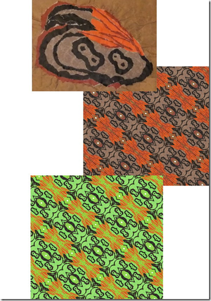
I started with the collaged wing. I photographed it. And used the kaleidoscope function on my graphics software until I created a nice design.
I liked the design, but it did feel like the curtains that my grandma had in the seventies.
So I decided to make some changes to the colour. I upped the yellow and green hues and ended up with a very light and bright picture.
But more definition was needed, so I copied everything with the colour black from the second picture and pasted it on my lime green background.
Now this was much better, but one more detail was needed.
Next I copied everything with the colour orange and pasted that on my lime and black design.
From boring and quite dull, I feel I have gone to a vibrant and exciting design.
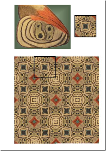
Next up was the oil pastel wing.
I also used the kaleidoscope function on this. But this time I cut a little square out of the pattern that emerged and pasted a lot of these squares together.
This resulted in this design (the marked out square shows the size and pattern that I started out with).
I really like this design, I can see this in a combination of patchwork, embroidery and raised couched threads.
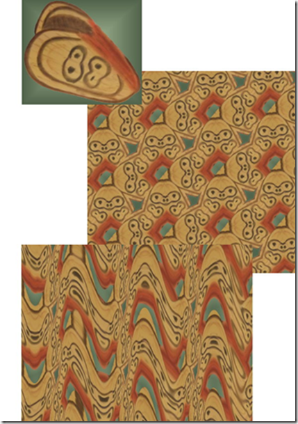
For the final design I used the soft pastel wing.
I started out again with the kaleidoscope function, which gave the picture a feel of chunky woodblocks.
I wanted something a little more delicate so I decided to add some waves.
This gave me the idea of 3 dimensional or raised work.
I pictured a green (gradient) background with an overlay of rows of waves.
The longer I looked at this the more I thought about the waves being layers of needle lace.
I wondered if I could make this visual in a picture?
I can see this either as a wall-hanging with a raised surface or maybe even a green tubular vase with an overlay of lacy waves.
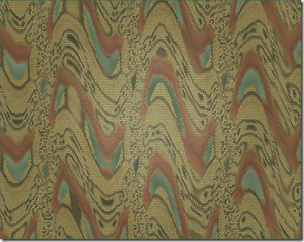
I found it pretty amazing how different all these designs turned out, after all the all they all came from the same picture!
First I did the exercise with the blocks, lines and moving space.
Then I had some digital fun with shapes.
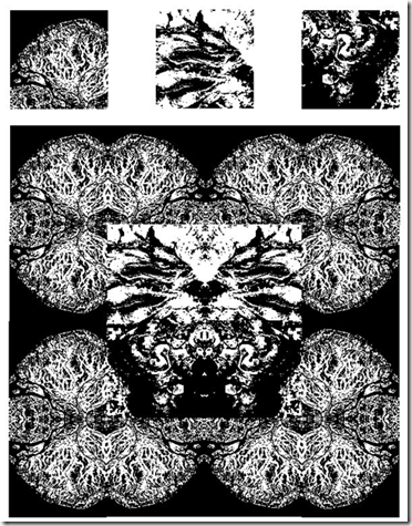
I “cut” some shapes out of 3 digital pictures and started playing with them.
Pasting, rotating, adjusting colour and turning them into black and white pictures.
Here is one example.
Above the three picture cut outs I used. The original pictures where satellite pictures of the earth from the National Geographic site.
Did you enjoy working with colour and were you able to mix and match colours accurately?
I did enjoy working with colours and I think I came close to matching the colours.
I achieved an almost perfect match while the paints were still wet, but of course they dry a little duller.
Were you able to use colour expressively?
I had to give this some thought. Seeing as a lot of my work is done from reality (pictures).
I never had to give colour as a separate component that much thought. I found it really interesting to use colour as a starting point instead of an afterthought.
In the end I think I succeeded in what I set out to do in the French knot picture and was able to use colour expressively there.
Did the exercises help you to really see colour instead of accepting what you thought you saw?
Yes, the exercises definitely helped me to see the real colours, instead of what my brain assumes is the colour.
Did you prefer working with watercolours or gouache paints? What was the difference?
For the exercises where I needed to match colours I preferred the gouaches. It gave me much more control over the end result. I found it easier to mix matching colours with the gouaches and because the colours are opaque I didn’t have to worry about the influence of the background on the final colour.
How successful were the colour exercises in stage 5? Where they more or less interesting than the painting exercises?
Hmmm…to be totally honest…I still feel much more comfortable with a needle, thread and fabric. So I really enjoyed the stitching exercises in stage 5 and 6. But the question is more or less interesting and then I do have to say that I’ve learned the most and discovered some things I really didn’t know whilst doing the painting exercises.
If you enjoyed them more, were there any factors that made them more exciting?
I think for me the excitement came from working with a limited, predetermined colour range.
That was a design challenge!
Posted by
Agnes Iley
9:26 AM
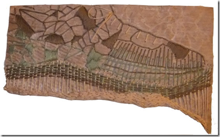
For this exercise I needed to work in pastels. Hmmm….don’t have many of those either, after some digging I found some “powdery” colours of thread. And seeing as we are hit by heavy snow and the roads are like sheets of ice, they simply have to do.
So I thought I would make the background a little more interesting. For some strange reason I love brown wrapping paper and paper bags. So I got a piece out crumpled and torn it and fused it to a piece of felt. I thought the colour might be a bit too strong so I gave the paper a little white wash.
Then I started stitching, I followed the lines of the torn paper and some of the crumpled lines. While I was working that little voice at the back of my head kept trying to tell me something, but I didn’t want to listen. Until my husband walked by and said “nice shoe”.
Sigh…..my total random stitching had produced a shoe, it couldn’t be more of a shoe if I planned it to be a shoe. So what could I do but add laces and give in?