Posted by Agnes Iley , Monday, December 20, 2010 9:25 AM
Stage 6 Combining textures and colour effects
Pointillism in stitches
When I thought about pointillism I always thought of paintings that looked like blown up giant newspaper photo’s. A bit like Marcus Harvey’s controversial portrait of Myra Hindley. Although this was not build up with dots, but a small child’s handprint, the concept is more or less the same. So I was surprised when I looked up Seurat’s work and saw the subtlety in his work. I expected strong graphics.
For this exercise I was inspired by the many pictures I’ve seen over the last couple of days.
I was looking at paintings done mostly in primary colours and wondered if it was possible to recreate this in French knots.

So I had some digital fun with this picture…..I posterized, lowered the number of colours and then replaced the colours with primary colours.
Then it was time to experiment with a new product, Golden’s digital ground. And although I’ve experimented with printing textiles before, this one was new to me. At first I was a bit disappointed, you paint it on like a gesso.
Hmmm….this would change the hand and texture of the fabric tremendously….or not?
After applying two thin layers, I put the fabric through the printer. Now I must tell you this was a proper embroiderer’s linen so very coarse and totally unsuitable for this sort of thing.
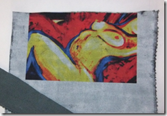
And what a surprise! Without changing the printer settings I ended up with the most vivid picture I ever printed on fabric! Very crisp and the fabric’s textures still showed!
I know I am going to have a lot more fun with this product….
Anyway this is what I ended up with.
The strip in the corner shows what the fabric was like before using the digital ground.
Pretty amazing I think.
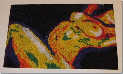
This picture immediately caused me some trouble, of course there was not one red, one yellow or one blue. Instead of blending the colours I decided I wanted strong colour blocks, so I used white, blue, purple, red, orange, yellow and green to fill in the picture with French knots.
After filling the picture in with French knots I added black silk to the background that I stitched down so it looked like a crumpled sheet.


Post a Comment