Posted by Agnes Iley , Thursday, January 6, 2011 9:41 AM
Every book needs a cover

So time to play a little more with Golden’s digital ground and the inkjet printer.
I must say I am very impressed with this stuff. I painted on two thin layers and despite adding this ground, after printing the hand of the fabric returned almost back to it’s original state. This was a firm jean type fabric to start with so I will have to experiment some more with lighter weight fabrics.
Dyeing, stamping and wonder under

This piece was very much “make-it up-as-you-go-a-long”, but initially I thought about adding the strips in a plaid type pattern. After laying them out that way they felt so stark and formal, not in tune with the stamped pattern at all. So a change of plan was needed.
Various samples

The pale blue one is a mono print. I rolled some paint onto a sheet of plastic and scratched the face into the paint with a skewer.
The little beige and green sample is a stamp made from rice grains. For this I took a piece of cardboard that I covered with double sided tape and dipped into some rice. I can see possibilities in this for as a background.
The bottom sample is the backside of a piece of painted fabric. The paint seeped through and formed an interesting pattern.
Shibori
My first trial with shibori. Actually a combination of 2 shibori techniques, maki-age en ori-nui. Now this all sounds very professional, but was my first ever attempt at this. On paper my design looked like this:

And simply because I find neat and tidy rather boring…the last square fell out of place.
The inner squares where done with maki-age shibori and the outer squares with ori-nui shibori.
After sowing all the lines and pulling everything tight, I dyed the fabric with black Dylon.
For my first attempt I am reasonably pleased with the result.
One border (bottom left) hasn’t come out as well as the rest. But overall not too bad, I think.
Fabric crayons

My inspiration for this piece was my French knot sample. I made a stencil and used a water-soluble wax resist. First I “waxed “ the areas that were supposed to stay white then went over the whole picture with yellow. Then I “waxed” through my stencil the areas that were to remain yellow, etc. After the red layer I decided to add the blue freehand.
The crayons are made permanent by heat setting with an iron.
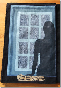
The window
Ever since seeing Patrick Caulfield’s painting of a window and visiting an 
With the masking tape the paint was layered a bit thicker then I normally would. This worked well for the window, but means it does show through. This gives it an almost ghost like feeling. Something to watch out for next time!
Lino cutting

But after making the stamp for my green fabric I wanted to try something a little more intricate. I found a fabulous photo on the internet, that I kept as an inspiration for a doll. I decided to turn the picture into a sketch (digitally). I transferred this sketch onto the lino with carbon paper and cut the design. I ended up with this print, which although not perfect pleases me a lot. I can really see me doing more of these in the future. Especially if I can get my hands on some finer cutting tools.
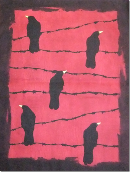
A blood red sky
For my crows on barbed wire I wanted a blood red sky. A colour that wasn’t that easy to create. Every time I thought I had the right shade it dried to light. Until I worked out that I needed to layer the red to create a blood red sky.
I cut some stencils from printer paper that were kept in place with the help of a temporary glue spray. A touch of yellow for the beaks made the whole picture come to live.
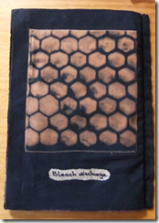
Bleach discharge


Post a Comment